Design
Arts & Crafts Woodland Home
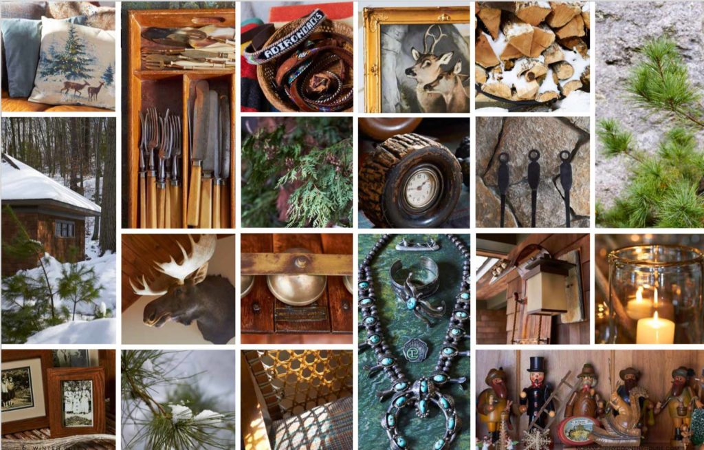
In love with this beautiful Arts & Crafts house showcased in Nora’s Winter Issue. This reminds me so much of the houses we stay at in Maine. Absolutely love the outdoor fireplace.
Read MoreClient / Designer Relationships
Building a designer / client relationship from Design Council on Vimeo.
Read MoreUniversal Truths on Project Completion Times
Today my friend Kelly sent over an article from the Unclutterer website called, “Three universal truths for why projects are not completed on time”. Within two minutes of reading the first paragraph and the three universal truths, Craig and I were into a discussion about how we’ve experienced them over the years. 1. “Clients are…
Read MoreProject Launch: CathySetterlin.com
Client: Cathy Setterlin Project: Website URL: http://www.cathysetterlin.com Software: Photoshop, Coda, CSS Edit, Web Developer Toolkit, IE Tester Cathy came to me looking to design a website for her business which she was getting ready to launch. I decided to use the project as an opportunity to push myself and code a site by hand again.…
Read MoreWebsite: Housatonic Friends Meeting
I haven’t shared much of my web design work. The Housatonic Friends Meeting website is based off of the Hemmingway theme for WordPress. Quakers are by a rule simple and plain and my objective was to keep the site that way as well. I integrated a Flickr feed of photos of the meeting house, along…
Read MoreGo Forth
America by Walt Whitman (1819-1892) Centre of equal daughters, equal sons, All, all alike endear’d, grown, ungrown, young or old, Strong, ample, fair, enduring, capable, rich, Perennial with the Earth, with Freedom, Law and Love, A grand, sane, towering, seated Mother, Chair’d in the adamant of Time. via (kottke.org)
Read MoreWireframing with Mockingbird
Earlier last week on Twitter I saw someone post a link to Mockingbird. I have enough trouble convincing project managers and sales people that wireframes are worth the time, so anyway to do them faster and easier I’m all for. I signed up for an account and laid out a sample page. The first thing…
Read MoreThe Power of the Computer in your Pocket
Americans have access to: 1,000,000,000,000 web pages 65,000 iPhone app 10,500 radio stations 5,500 magazines 200+ cable tv networks Pretty impressive numbers. The folks at XPLANE™ have created another video educating and inspiring the community. This is from their Did You Know series. We forget sometimes how much things have changed and what kind of…
Read More